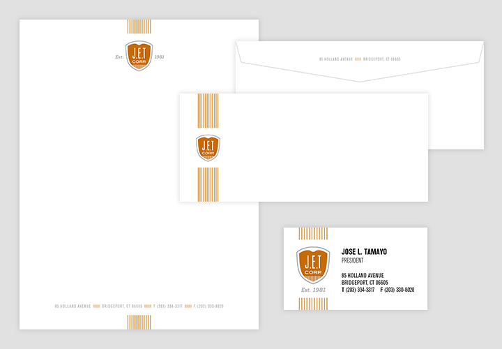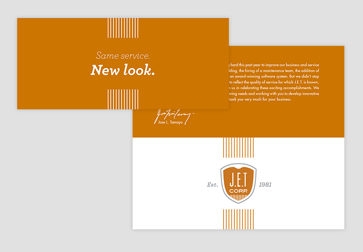
J.E.T. Corp.
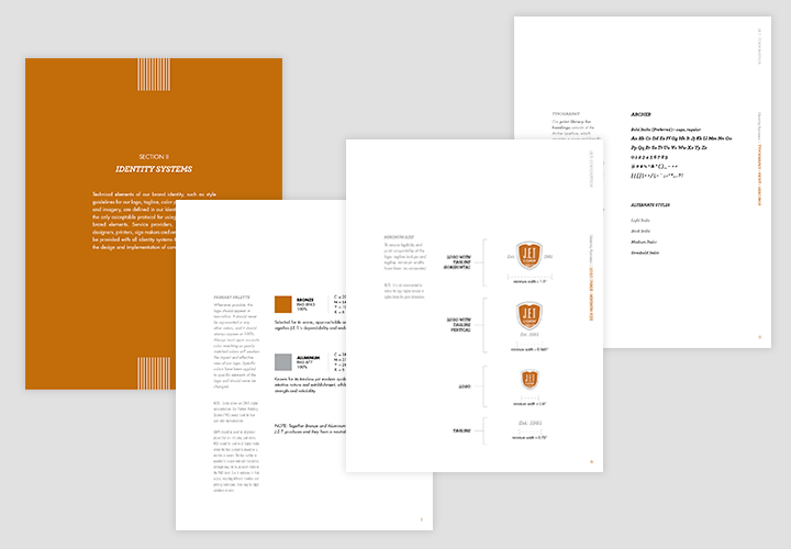
Branding created for a small foundry in Connecticut who had recently changed it's President, and wanted to reinforce to it's customers that they were here to stay. Specializing in small runs, quick turn around flexibility, J.E.T. Corp. desired an identity that conveyed strength, stability and longevity. A "shield" style logo was developed that incorporated a subtle illustration of a crucible getting read to pour into a mold. The vertical lines in the logo emphasize growth and connection and were used as an identity graphic across their brand announcement, stationery and apparel.